MOZILA – Full Visual Identity & Strategy for an Industrial Brand
MOZILA is a Georgian brand specializing in dry construction mixtures engineered for professional building processes. The product line stands out for its high durability, stable quality, and practical application, ensuring reliable results for both interior and exterior works.
Our challenge was to establish a distinctive, modern, and highly systematic brand identity within a traditionally conservative and heavily commoditized industrial sector. The team at Kibe Consulting took full ownership of the brand's comprehensive transformation, resulting in the creation of the official MOZILA Visual Style Guide.
Brand Architecture & Geometric Precision
The core of the brand identity is its logo. Circular symbol that represents motion, stability, and the flawless blending of components.
-
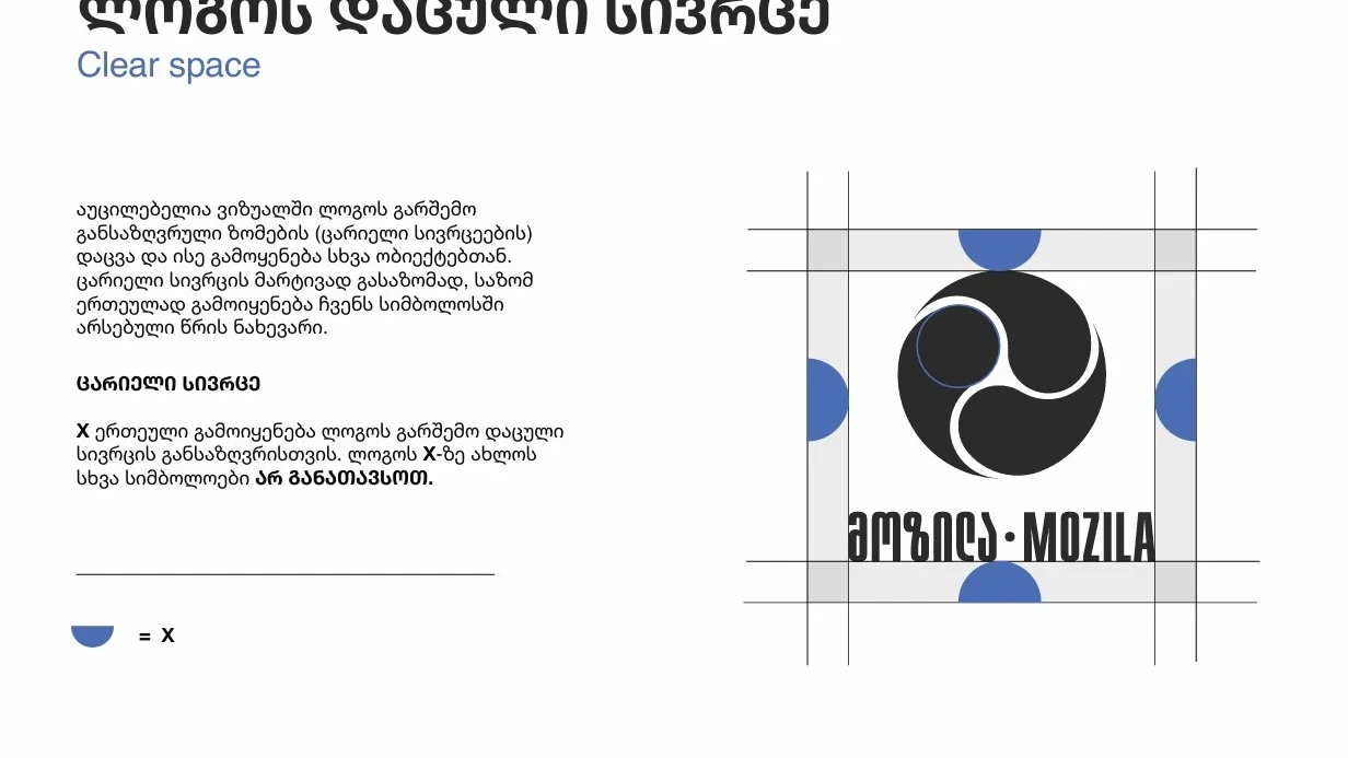
Logo Architecture & Clear Space: To ensure correct and consistent brand representation, strict geometric rules were implemented. For effortless measurements, half of the inner circle within the symbol was established as the primary measurement unit (-unit). This structural approach completely prevents incorrect proximity to other visual objects.
-
Minimum Sizes & Restrictions: Precise constraints were set for both digital and print mediums (e.g., the isolated digital icon must never drop below 60 pixels). Furthermore, clear prohibitions were instituted against stretching, distorting, altering colors, or introducing unauthorized typography.
-
Flexible Alternatives: To seamlessly integrate with partner brands and various print formats, alternative composition layouts were engineered, fully preserving core proportions.
Color Palette & Typographic System
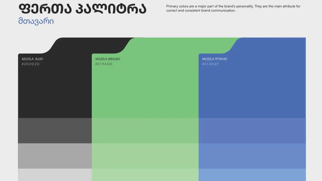
To drive visual differentiation in the construction materials market, we selected a bold, premium, and highly functional color system:
- MOZILA Black (#2D2D2D): Evoking strength, authority, and professionalism.
-
MOZILA Green (#019ADE): Symbolizing sustainability, innovation, and renewal.
-
MOZILA Blue (#014D6F): Standing for reliability and technological accuracy.
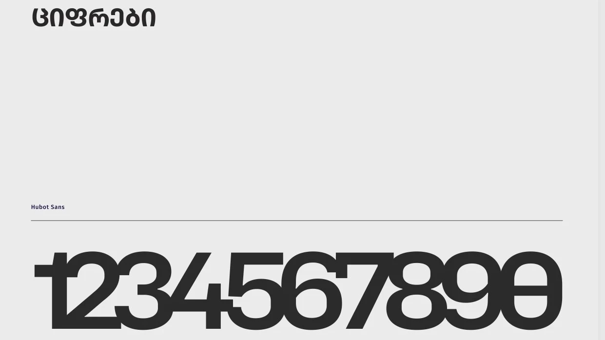
Typography: A robust, stylized geometric typeface was chosen for primary headers, while Noto Sans Georgian (Bold, SemiBold, Medium, Light) was integrated for auxiliary print and digital communication, alongside Hubot Sans for numeric data. This architecture guarantees perfect legibility across all scale variations.
Graphical Elements & Packaging Architecture
To facilitate smooth scaling, we engineered a unique graphical language:
-
Product Iconography: Custom pictograms were designed to highlight technical attributes (such as frost resistance, crack durability, and a 24-hour traffic-ready indicator), instantly delivering value propositions to the end-user.
-
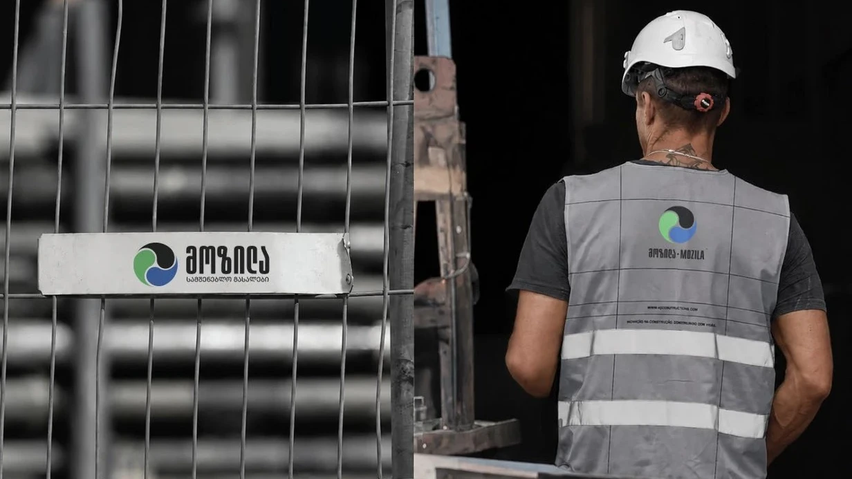
Supporting Assets (Shapes): Derived from the geometry of the logo, custom "tag shapes" were created to be deployed across branded workwear, 25 KG product bags, and outdoor billboards.
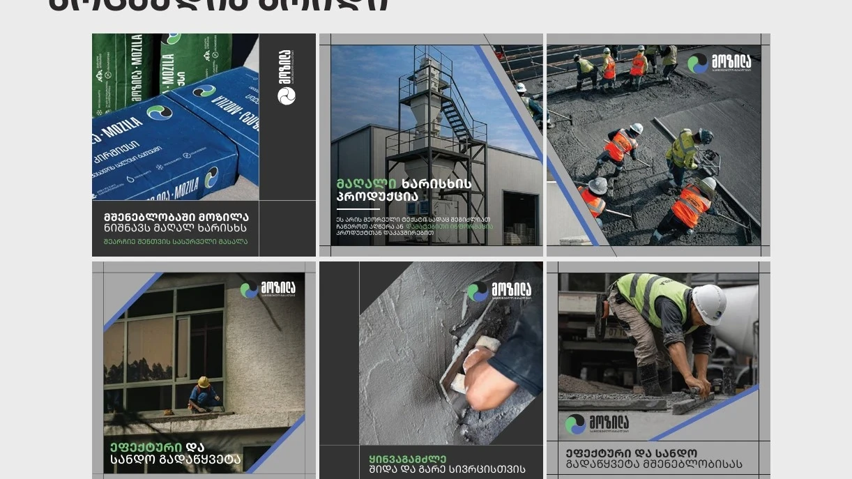
Digital Media & Social Media Grid
Modern construction manufacturing demands premium digital positioning. We structured modular social media frames and a unified grid layout. The intentional synthesis of high-quality photography and geometric visual blocks allows the brand to maintain an upscale, instantly recognizable presence across platforms like Facebook, Instagram, and LinkedIn.
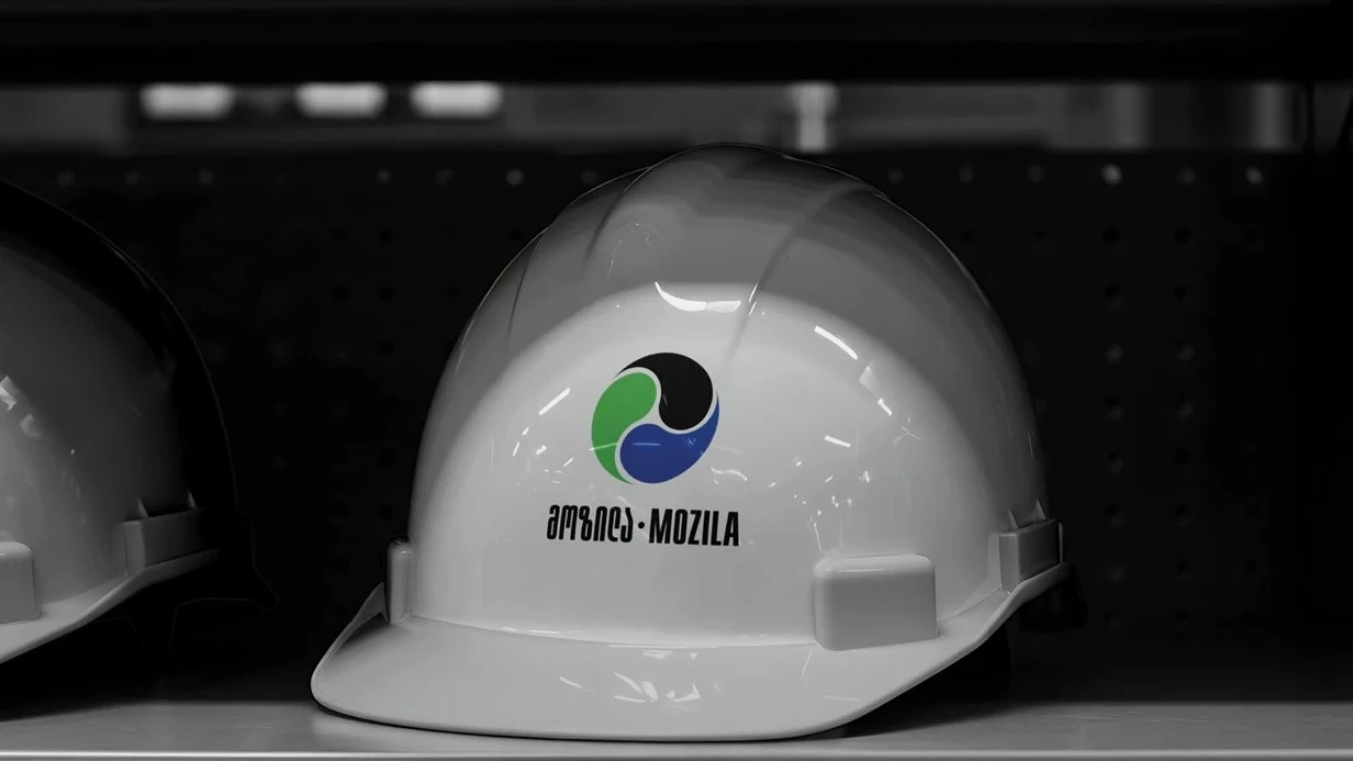
The Result: MOZILA received far more than just a logo; they acquired an entire operational visual ecosystem. The brand book developed by Kibe Consulting guarantees absolute consistency at every single touchpoint—from business cards and high-visibility vests to large-scale digital advertising campaigns.
This project was implemented in partnership with the Kollektiv agency and with the support of Enterprise Georgia.