Rec N Roll – Minimalist Brand Architecture & Digital Identity for a Video Production Company
Rec N Roll is a modern video production company dedicated to creating high-quality visual content. Given the nature of the creative industry, the brand's identity needed to be dynamic, adaptable, and strictly structured.
The objective for Kibe Consulting was to engineer a unified, sleek, yet powerful graphic statement to align all communication channels for the production house. Based on this strategic vision, the official Rec N Roll Identity Guidelines were created.
Logotype Concept & Geometric Proportions
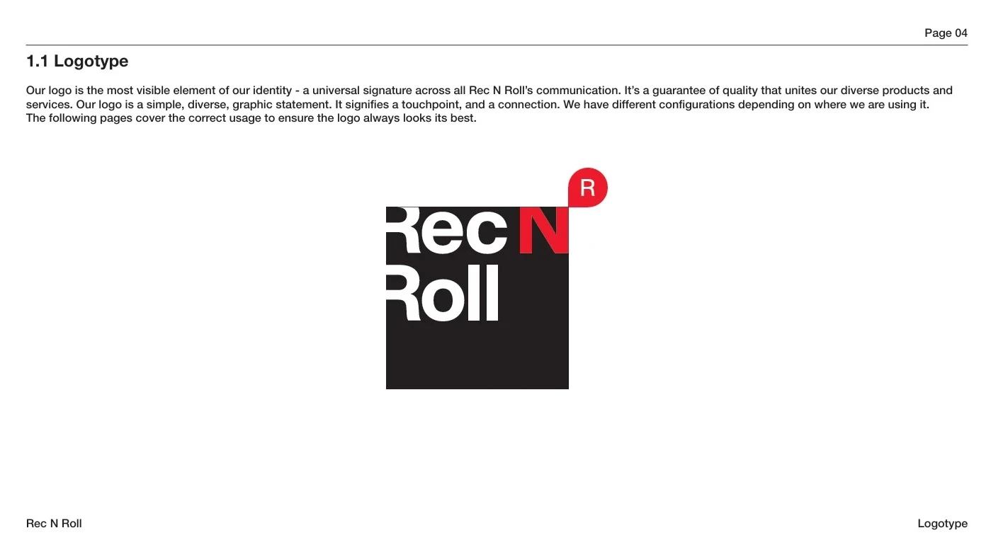
The Rec N Roll logo is the most visible element of the brand's identity—a universal signature across all communication channels. The visual concept is built on a smart synthesis of geometric contrast and shapes.
-
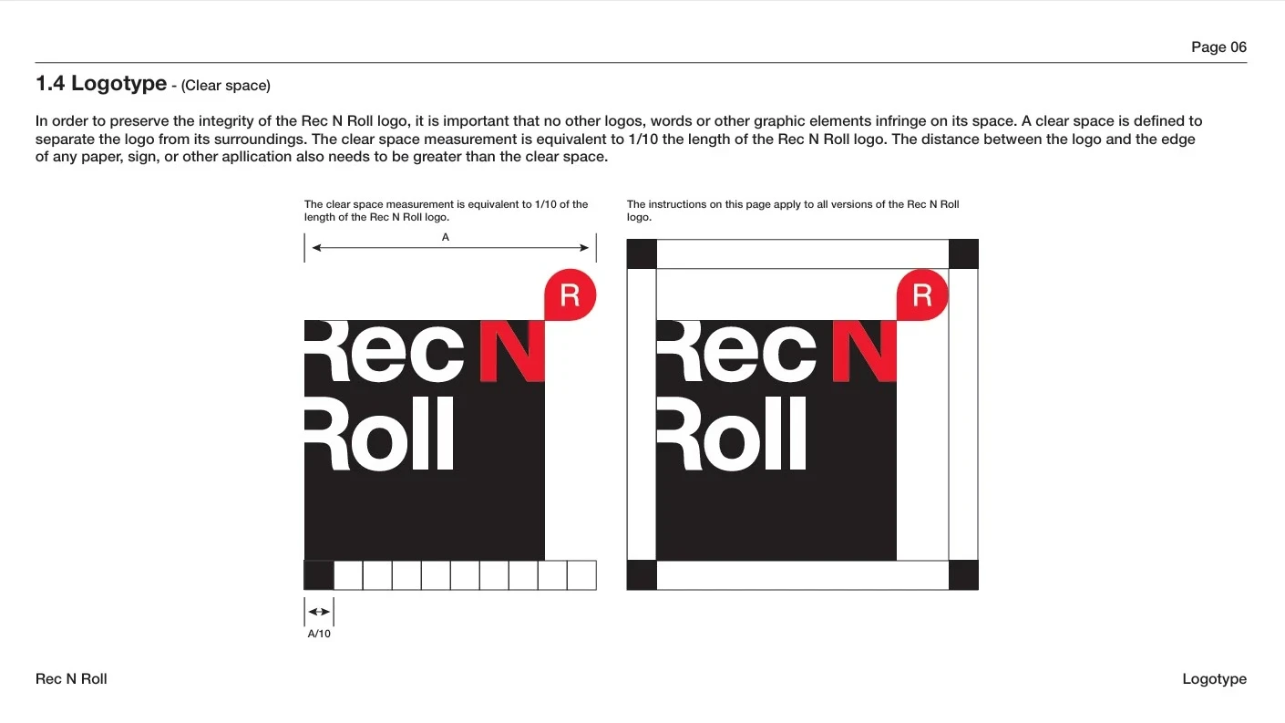
Logotype Clear Space: In order to preserve the integrity of the Rec N Roll logo, it is essential that no other logos, words, or graphic elements infringe on its space. We defined a clear rule: the clear space measurement must be equivalent to at least $1/10$ of the total length of the logo ($A/10$). This distance must be strictly maintained from the edge of any layout.
-
Large & Small Scale Use: The system accounts for two sizing configurations. While there is no maximum size restriction, for small-scale use, the width must not drop below 3 cm to guarantee absolute legibility.
-
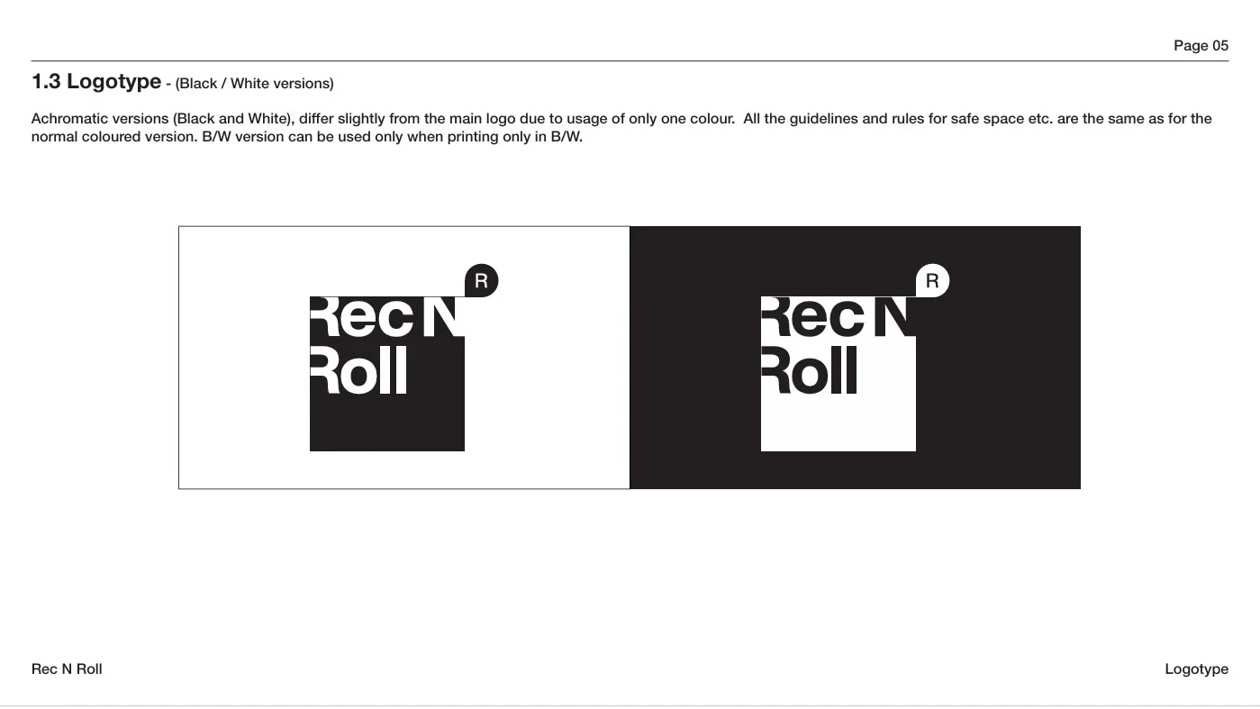
Achromatic Style (Black & White): For specific production and printing needs where color printing is unavailable, monochromatic versions were engineered. These follow the exact same structural proportions and safe zone restrictions.
Unacceptable Uses of the Logotype
To promote the consistency of the brand and eliminate visual chaos, clear guidelines were established illustrating possible misuses that must be avoided:
-
It is prohibited to add a stroke to the full logotype, rearrange its elements, or rotate the graphics.
-
It is forbidden to distort the shape or proportion, place the logotype over non-compliant backgrounds that inhibit legibility, or add filters and drop shadows.
Contrast Color Palette & Personality
The core colors give Rec N Roll its distinct, high-energy personality. Standardization of color across different media types was a prime concern to ensure accurate representation.
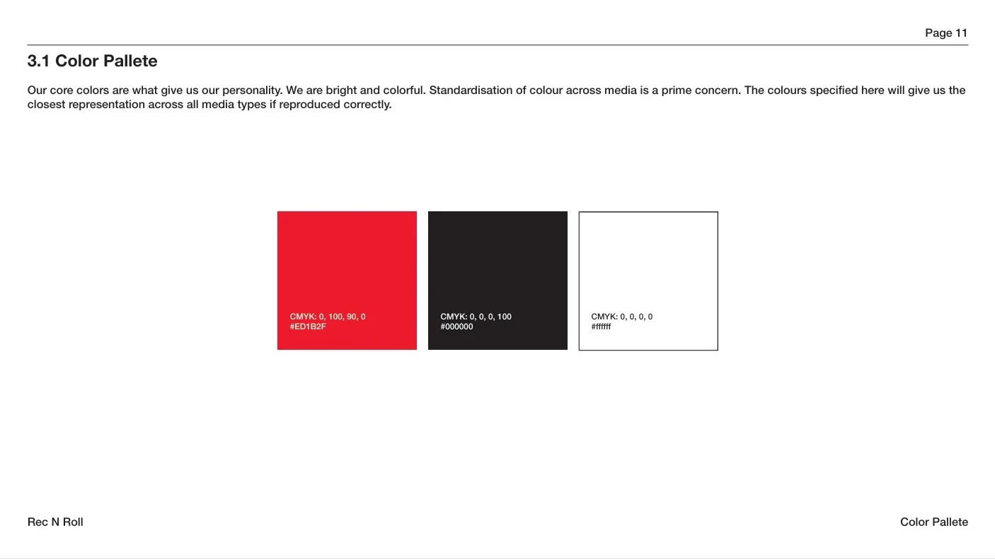
The palette consists of three primary components:
-
Rec N Roll Red: Signifying energy and connection —
CMYK: 0, 100, 90, 0|#ED1B2F. -
Solid Black: For contrast and grounding —
CMYK: 0, 0, 0, 100|#000000. -
Pure White: For visual balance —
CMYK: 0, 0, 0, 0|#FFFFFF.
These exact color specifications yield a flawless, closest representation across both digital screens and physical media.
Typographic Cohesion
Typography is an important aspect of the brand's identity, contributing to its distinctive aesthetic. Helvetica Neue (Regular and Bold) acts as both the headline font and body text font.
The chosen typography usage ensures clean, structured communication and supreme legibility in both Georgian and Latin scripts, which is critical for international corporate operations and scaling.
The Result:
The identity system engineered by Kibe Consulting provides an ironclad visual foundation for Rec N Roll. It empowers the video production house to execute its marketing and corporate communications with a single, authoritative voice, directly boosting brand recognition and market trust.
This project was implemented in partnership with the Kollektiv agency and with the support of Enterprise Georgia.